Feels like the year 2022 is just getting started, and we can already see some packaging design trends that will dictate what we are about to witness on store shelves this year. In fact, this happens annually: innovation in packaging design comes and goes all the time.
While 2020 and 2021 saw an emergence of minimalist design, 2022 will further build on this concept through a variety of design considerations. In 2022, designers will experiment with colors, typefaces, shapes, vintage motifs, metallic colors, and other elements to surprise viewers.
So, without further ado, here are the top 10 packaging design trends worth to follow for 2022. Buckle up, dear friend!
1. Remembering the old times
Many of this year’s design trends are rooted in nostalgia. Whether it’s the pandemic-affected lifestyle that we witness or the start of a new year, people tend to think about the old days. Consequently, we can tell that vintage style packaging will perform well on the shelves this year.
A great way to infuse this kind of atmosphere into a new design, is by creating an old charm aesthetics with the help of toned-down colors, simple clear layouts, script characters and dated ink-like monotone illustrations. Even the material of the packaging can play a vital role in this story – if we choose anything else than plastic.
Authenticity and tradition can easily be communicated by using a vintage design style.
Still, thinking back about the “old”, we have seen an increase in 60s psychedelic-inspired designs reminding us of a time of free love, peace, and happiness that more and more people are missing today.
Pop art color combinations, groovy fluid shapes and distorted typefaces are the ingredients of perfectly made 60s inspired design that will for sure grab your attention!
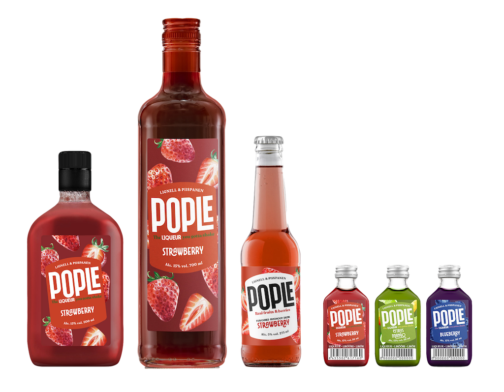
2. Type to design
Sometimes in the past, the artful characteristics of different typefaces have been overlooked, but not anymore, as the type design has made its comeback lately.
This trend in packaging design tends to use at a minimum, or even completely remove, the presence of an image or product illustration, giving the spotlight to an intricate, unique, bold, even loud type element that will occupy most of the frontside of a package. Often the font is treated as a piece of art, gaining importance over readability. Add to this contrasting modern colors, and you have a product that will be easily recognized in the sea of products.
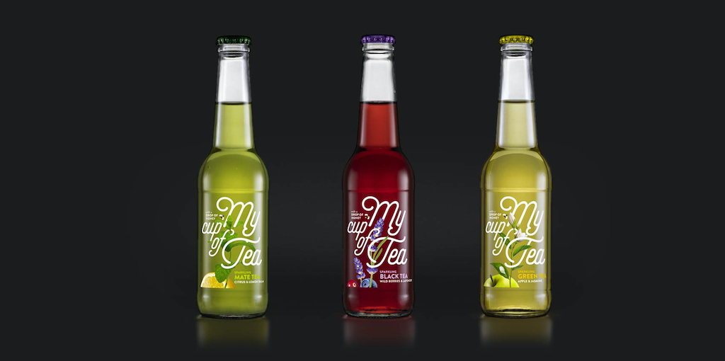
3. Less than more
Unfortunately, the year 2022 will likely keep being gloomy in the world, which in turn underlines the necessity of serenity and calm in the packaging designs of everyday products. Actually, we have already noticed an accentuated turn towards minimalism with its muted colors, classic typefaces, simplistic copy, and clear design grids. In this case, the materials and the finishing of the packaging surfaces play an important part. After all, they are often seen as communicating quality.
But let’s not forget about the importance of negative space, that will make it easier for consumers to focus on what matters most – how to remember your brand.
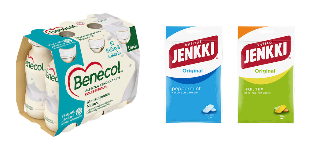
4. 3D point of view
Modern 3D elements bring a sophisticated look to every design in which they are leveraged. Whether we are talking about a 3D style of illustration, an embossed detail on the pack (Fresnel films) or even implementing a new twist with the help of AR technology, the possibilities nowadays are endless!
Playing with depth and perception will create an intricate design that will demand attention. Implementing the newest technology possibilities into your design could translate into the perception of a more expensive and high-end product.

5. Inside out!
We are used to encounter daily, blank, unprinted inside surfaces of the packages. But now, the time has come to turn the inside out.
This new trend takes advantage of our nonexistent expectations and implements the “surprise element” on the inside surface of the packaging. Imagine a classic plain trench coat with a beautiful lining on the inside that make you want to wear it inside out. The outside surface is treated in a minimalistic way, only presenting the most important elements like logo and product name, and shifting the graphics, colors and other explanations on the inside part.
The aim here is to create an experience, an unexpected excitement, that reveals itself in the unboxing-unpacking moment.
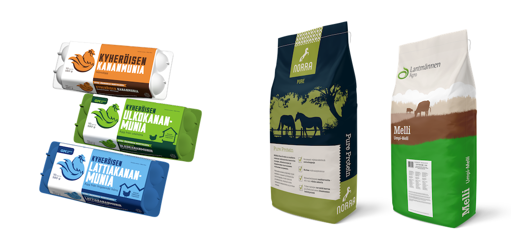
6. Sustainable approach
The need for sustainable packaging solutions is increasing everyday all over the world. Ethical, compostable, or recyclable packaging materials are a must if you want to show that you are serious about your sustainable positioning.
Also, colors are to be considered. Forget about the neon, noisy, extra saturated colors, and choose pastel, muted, earthy, natural colors. Add hand-drawn illustration style to create the perfect craft for a natural look.
7. Overlay collage
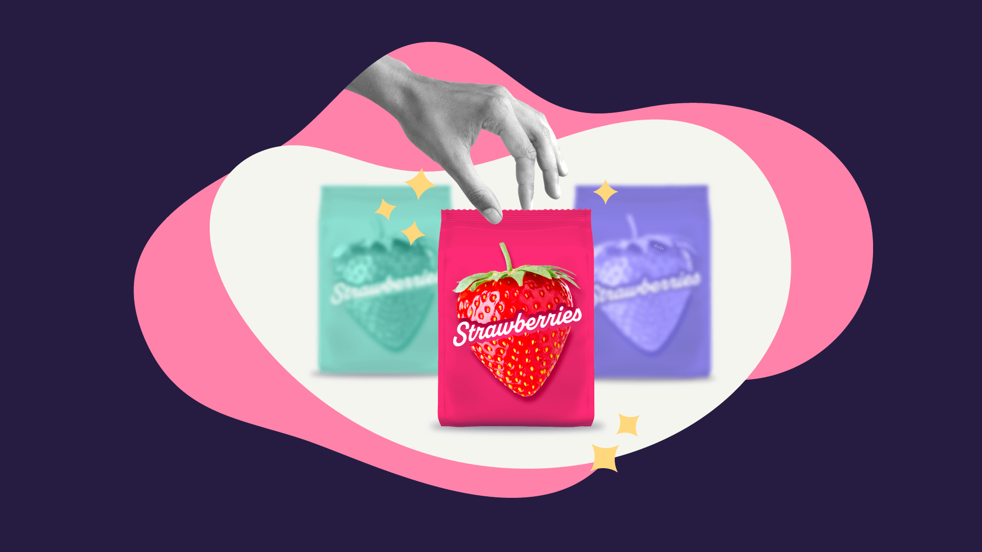
The collage technique is still in trend, but this time we are talking about layering different shapes and colors to create an interesting design. Such designs stimulate the excitement and fascination and will trigger people to enjoy the packaging as a piece of art.
Busy backgrounds need a classic font. Hence, sans serif typefaces will perfectly complement the design.

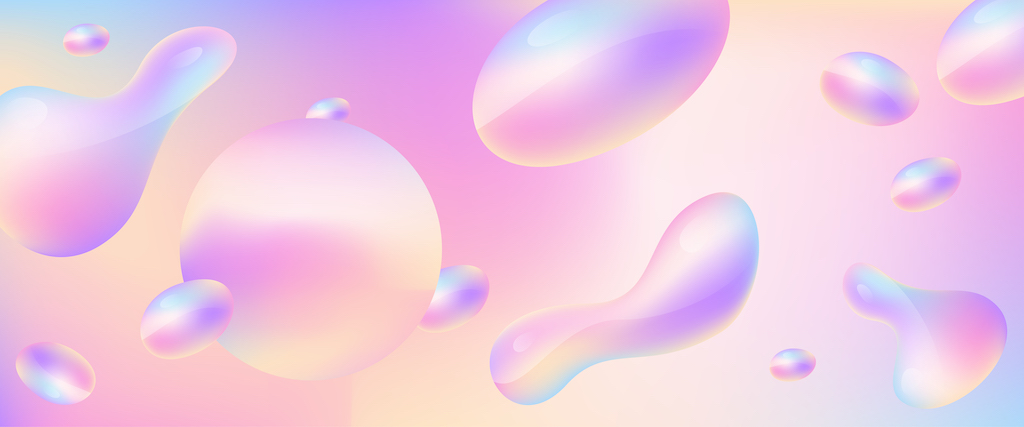
8.The Y2K aesthetic
Y2K trend dates back to 1995–2004. It got its name from the year 2000 tech bug, where computers were believed to have issues with the formatting and data of calendar’s storage after the Millennium. In terms of packaging design, we must think about metallic colors, iridescent prints, and get our inspiration from everything that is tech-related. Geometric shapes, dynamic compositions, gradients, pale colors, silvers, black and white hints will surely create that retro-futurism vibe we are aiming for.
9. Sense of provenance
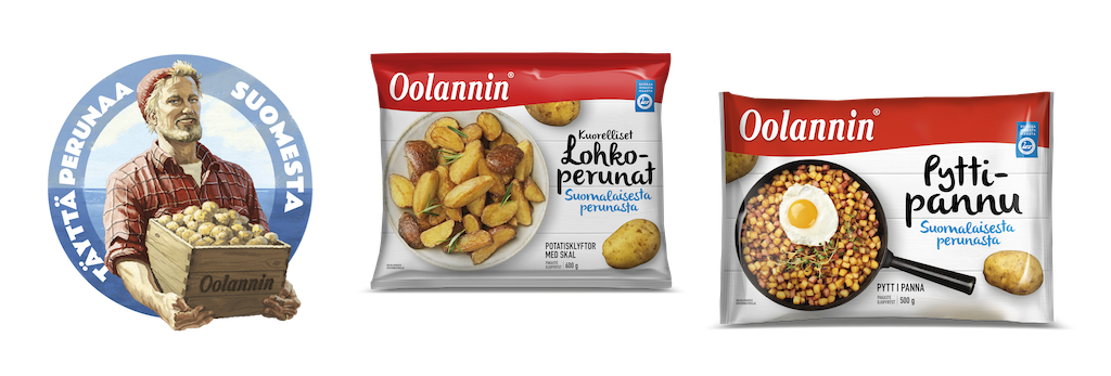
If we desire to showcase the origin of a product, the best way to do so is by using localized illustrations in our designs. Most buyers are looking for a connection between the quality of the product and its place of origin.
The illustrations can show a part of the region’s history, a landmark, a piece of well-known art, or even create a storyline describing how the product is made. In this way we will create a unique personality for our product.
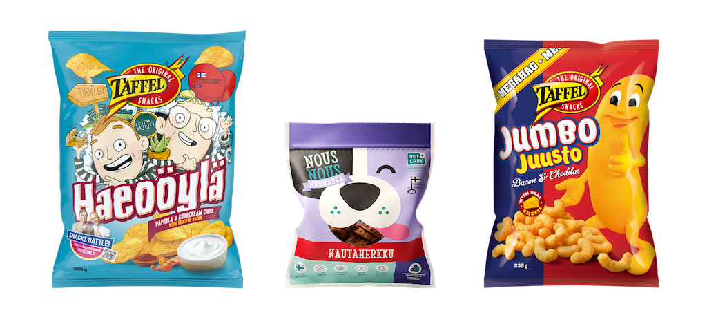
10. The comeback of the characters
Whether we are talking about rubber hose characters, or illustrations drawn in a child-like ironic almost on the edge of meme culture style, we have seen a comeback of these lately.
This style has taken inspiration from the street style. It feels somewhat rebellious but at the same time has the power of making you smile.
Wrap it with positivity
Serene colorways, charming characters and nostalgia; if there’s anything we can learn about 2022 packaging design trends, the key take-away is evident – consumers are now looking for positive vibes.
