Another year, another blog post for packaging design trends of the year. In 2023, we will see playful, vivid designs that will surely gain attention on the shelves. So, without further ado, here are the top 10 packaging design trends worth to follow for 2023. Time to unpack the pack!
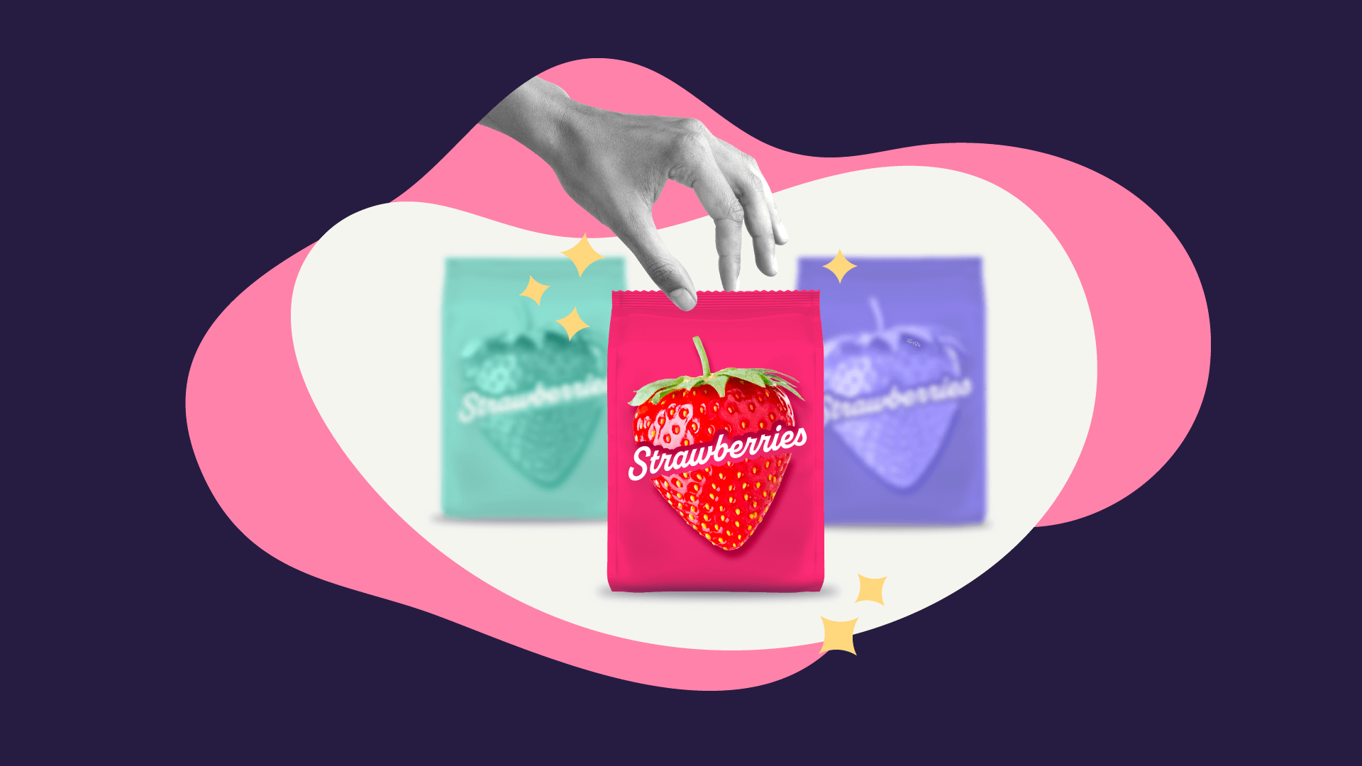
1. Illustrated flavors and bright colors
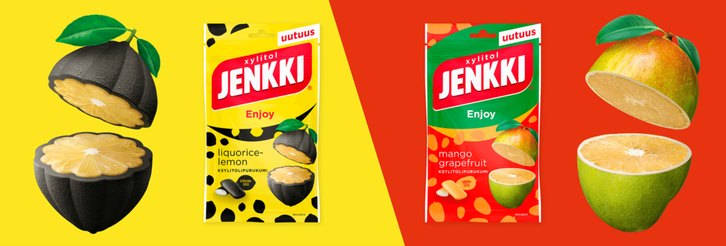
Nowadays people are more and more aware of what they eat, and they tend to appreciate transparent brands that state all the ingredients clearly and truthfully. An emerging trend in packaging design is to illustrate the ingredients on the pack, to make them part of the artwork. Not only does it capture the attention of the consumers who want to know the ingredients in a glimpse, but it can also differentiate the flavors within a product range.
The visual style in this trend tends to lean towards cartoonish and youthful, as it aims to bring back childhood memories. It relies on fresh, juicy pops of color, doodles or stamped-like details to make the packaging look appealing and fun.
2. Tactile texture
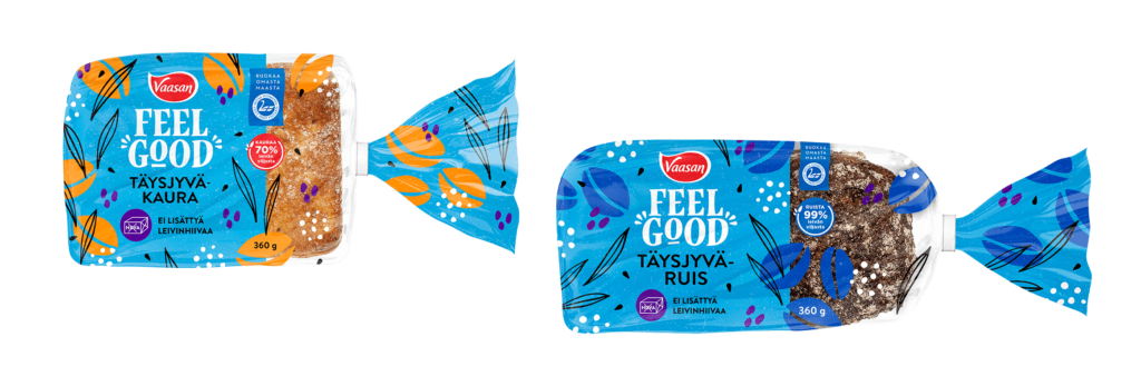
As brands always look for ways to make their packaging stand out, we are seeing a rise in techniques that add texture to the packaging like special varnishes, embossing/debossing, interesting transparent inserts in the artworks, or even special foil printed details. Using these types of techniques, the perceived value of the products can be easily increased, associating them with high-end brands.
Even though much of our everyday lives gravitate around a digital landscape, this packaging trend reconnects us with the sense of touch. There is something about how a product is remembered when the senses of sight and touch are intertwined in the same experience; it will only boost up the brand recall.
3. Wrap-around patterns
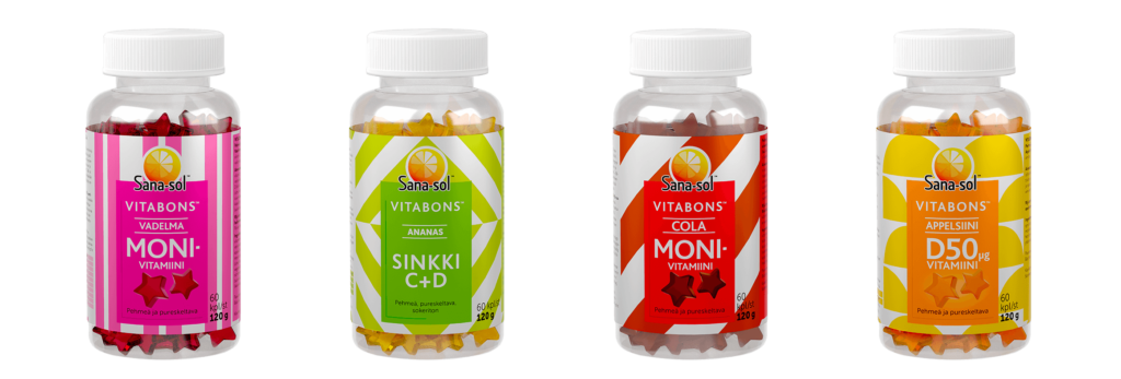
Surprise in the category!
Why should vitamin packs be boring?
Wrap the eye-catcher around the packaging and you get a product that stands out from the category in a playful way. It creates curiosity, and together with a trusted brand, encourages people to pick up the product and take a closer look at it. Often, the differences in product variant labels focus on color, but this example strongly shows the influence of the shape of the pattern. When used skillfully, the patterns almost make the product move in different ways, which in this case is suitable for vitamins as they really do make you move.
4. Typography experiments
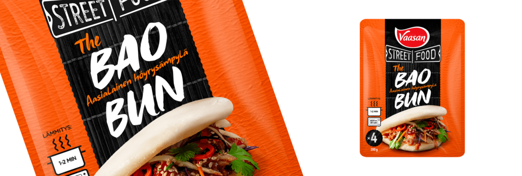
Typography has always played an important role in packaging design. Not only does it communicate the product name, but it should also be catchy and visible enough to stand out from competitors and get people’s attention.
Keeping this in mind, one of the packaging design trends that should be explored further is all about typography experiments. Statement typefaces, warped into filling different shapes or treated with different textures, have such many creative variations yet to be experimented.
The personality of a font and its uniqueness can do wonders in capturing the authenticity of your product without having to say it out loud.
As an example, lately, we have seen a rise of handwritten or scribbled text in packaging design.
5. Mascot variations
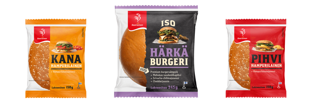
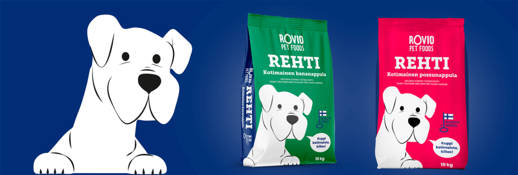
The brand characters on the packaging are timeless, and they effectively create distinctiveness and personality. Several generations in Finland recognize this about fifty-year-old figure, which our dedicated Art Director has already taken care of in four decades!
For the sake of continuity, changes to the character’s appearance and behavior should be made carefully. In the packaging, the figure has been used as a distinguishing symbol of the product variant group – it only changes slightly its clothing and stance from product to product in order to emphasize the special features of each variant.

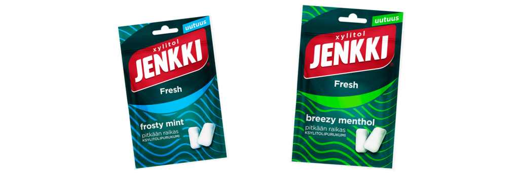
6. Euphoric colors
Flashier, brighter, saturated colors will get more attention – we all know it. That is why in 2023, ecstatic colors will be increasingly popular in packaging design. Because of their boldness, brightness, and high saturation, they create a confident, fearless appearance. But even more interesting is how playful and whimsical these colors can be! They can give us a sparkle of hope and joyfulness as we look ahead. So, if your product lacks visibility on the shelf, using flashy colors might be a good solution to get attention on the packaging.
7. Cartoon charm
Cartoon characters have always had a special charm. Besides being aesthetically cute, it creates a fun, fantasy feeling when we can see the characters in wacky situations. Choosing to incorporate a cartoon character in the artwork of a packaging design can also strengthen the brand’s personality. In 2023, the visual style of cartoon characters leans toward a classic, minimalist style similar to the comics from newspapers. If you aim for a silly and goofy result, an effortless, hand-drawn style that embraces imperfections, is the way to go.
8. Product visuals with creative twist
Product Visuals are a key component in packaging design, useful for describing the contents or the flavor of a product. Using abstract interpretations plays with our expectations and leans into our freedom to imagine and express ourselves creatively. The idea here is to allude to what is inside, rather than simply placing the product on the packaging. The results are some new stand-out product designs with a creative twist.
9. Bold designs – strong typeface and prominent image
In 2023, brands will go all out with strong, bolded typefaces and prominent product images. Nowadays, consumers don’t have much time to spare. Therefore, visible typefaces and oversized images form the perfect mix to attract their attention at a glimpse in order to, naturally, convincing them to purchase the product.
Bold designs are relatively easy to grasp and remember. They can additionally convey the brand message and the product’s highlights in split seconds, turning in more conversions for your business.
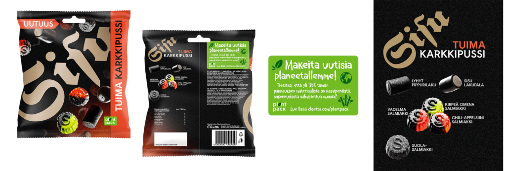
10. Back of pack
The front part of the packaging takes the stage in attracting potential buyers, but fortunately the back of pack (BOP) is also essential to secure the purchase.
BOP can be more than just a space for ingredients and nutritional information. It can be used as an effective marketing tool to promote your brand and build engagement. It is the perfect space to tell the brand story or brand’s unique selling propositions (USPs) to stir engagement with the consumers.
Remember to highlight all the benefits and sources of the product on the BOP. If the brand sources its ingredients from authentic farms or other special sources, here is the perfect space to communicate this to your customers.
Positive sells on shelves
As it was in 2022 (read my last year’s packaging trend blog post here), in 2023 we will continue to see positive vibes in packaging designs.
Whatever your need is, whichever product you have, you can definitely rely on us in refreshing your product’s packaging design. Let’s do it!


