
Colour is not just colour – it is a choice that tells your customers what to except from your product. Whether you want it to or not, colour makes a statement about what your product is, what it contains and what it stands for. So make that statement a strategic part of your package design.
Let’s start with a small test: walk down any supermarket aisle and blur your eyes for a moment. You will not really see logos or typography – you’ll see blocks of colour. That’s how fast colour works. Long before someone consciously observes your brand name, the colours on your pack have already told a story about what the product is, who it is for and how it might taste – or even how much it costs.
In those first two or three seconds on the shelf, colour quietly answers a few essential questions:
Is this product for me?
Have I seen something like this before?
Does this feel like something I would trust or enjoy?
If the colour choices are off, the product can become confusing, invisible, or feel slightly “wrong”, even if everything else in the design is perfectly done.
Treating colour as strategy, not decoration
When developing packaging, it’s tempting to treat colour as the ‘fun part’ at the end – something to explore once the logo and layout are done. But that would be a mistake.
Colour is one of the most strategic decisions you can make. It shapes perception in seconds, guides the eye on the shelf, clarifies flavour and category, signals ingredients and values, and positions your product in the right mental drawer: premium, every day, playful, technical, natural and so on.
Used with intention, colour becomes a powerful language your product speaks before the consumer even realizes they are listening. Used carelessly, it can make a genuinely good product feel confusing, invisible or out of place.
That is why in packaging design, colour isn’t just about “what looks nice on screen.” It’s about what tells the clearest, truest story about your product in the few seconds you have to earn a spot in someone’s basket.
Colour as a silent salesperson
On shelves, packaging doesn’t get the luxury of a long introduction. Colour becomes your silent salesperson, waving at the shopper from a distance. It is the first hint that a product belongs to a certain category.
Some brands use powerful colour blocks to claim their space and stand out from the crowd; others prefer quieter tones that fit neatly into an established category and reassure the consumer. The real challenge is finding that sweet spot between standing out enough to be noticed and fitting in enough to be understood. Colour is often where that balance is won or lost.
Positioning: Premium, Fun, or Every day?
The main colour choice plays a huge role in positioning your product in the shopper’s mind. Deep blacks, navies, burgundies and muted, sophisticated palettes are strongly associated with premium products. Add subtle metallic touches like gold, silver or copper, and you reinforce the feeling of something special or high-end.
Every day and value products, on the other hand, often rely on brighter, bolder colour combinations and high contrast. Their job is to be straightforward and quickly legible: this is what the product is, this is the flavour, this is your regular choice and, most of the time, this is the more affordable option.
Playful brands live in yet another world, full of saturated hues, surprising combinations and expressive palettes that feel young, energetic or quirky. Even without reading any copy, the consumer will often guess whether something is meant to be a little treat, a daily basic or a giftable premium item simply by looking at the colours.
Every product category develops its own colour code over time.
- Dairy often leans on whites, blues and soft pastels.
- Cleaning products shout with bright blues, greens and high-energy tones that suggest power and freshness.
- Kids’ snacks are usually saturated and playful, full of primary and candy-like colours.
- Wellness, supplements and natural skincare tend to move in the opposite direction, favouring soft neutrals, greens and earthy, muted palettes.
The most interesting brands respect the basic visual language of their category, so they stay legible, but they also introduce a twist: a slightly unexpected shade, a different combination of tones, or a more minimal and controlled colour story. That small shift is often enough to carve out a recognizable identity without losing the category cues that make the product easy to understand.
If your price point and your colour story don’t match, you create friction. A very pricey item wrapped in cheap visual cues, or a basic product dressed in ultra-luxury tones, can both feel untrustworthy. People sense that something is off, even if they can’t articulate why.
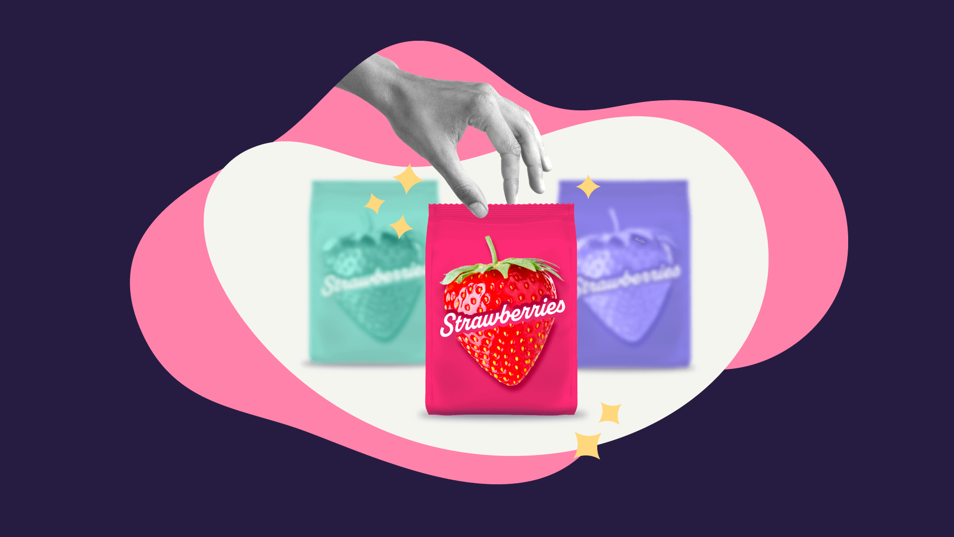
Flavour lives in colour
In food and drink especially, flavour doesn’t start with words, it starts with hues. We are so used to reading flavour codes in colour that we hardly notice it anymore. Red suggests strawberry or cherry, yellow whispers lemon or banana, green hints at lime, apple, herbs or freshness, purple feels like berries or grape, warm browns call to mind chocolate, coffee, caramel, or baked goods.
When a brand fights these expectations too aggressively, it risks confusing shoppers. A strawberry yoghurt in blue packaging might look striking on a designer’s screen, but on the shelf most people simply won’t recognize what it’s supposed to be. That doesn’t mean you can’t break the rules – you absolutely can – but if you do, you need to support the story with strong flavour visuals, clear wording and a consistent system across your range. If the colour code doesn’t help, the rest of the design must work twice as hard to communicate flavour clearly.
Colour as a signal of ingredients and sustainability
Colour doesn’t just hint at flavour and category, it also says a lot about what’s inside the product and what the brand wants to claim about its values. We have all seen how green and earthy tones have become shorthand for naturalness and sustainability positioning.
- A palette built on greens, beiges, kraft browns and soft whites brings to mind plants, earth, simplicity and fewer processed ingredients.
- Darker greens and deep neutrals can convey a more serious, grounded, almost botanical feeling.
- Crisp white can feel clean and pure, as if there’s nothing extra or unnecessary in the formula – an idea that was recently implemented by a snacking brand – Doritos Simply NKD.
On the opposite side, very bright or neon colours can hint at intensity, artificial flavours or high performance, depending on the category. This doesn’t have to be negative. In some contexts – like candy, energy drinks or powerful cleaning products – those hyper saturated colours are exactly what people expect.
The important point is honesty. If the packaging uses ‘eco colours’ to imply natural ingredients, but the ingredient list doesn’t support that story, consumers will feel the disconnect.
Colour breaks a product when it stops helping the shopper and starts confusing them.
This happens when the flavour can’t be clearly guessed, when the pack looks too similar to competitors and disappears on shelf or when the colours send conflicting signals about what the brand stands for. A design can be beautifully crafted in terms of layout and typography yet underperform simply because the colour decisions don’t align with the product, the category or the audience.
Sometimes the issue is subtle: a palette that feels slightly too childish for a serious health product, or too cold and clinical for something meant to be cozy and indulgent. Other times, it’s more obvious, like a promise of ‘natural’ packaged in intense neon tones that scream artificial.
At LM Someco, we believe colour should never be an afterthought. We help brands translate their story, flavour and values into smart, strategic colour choices that work in the real world of crowded shelves and quick decisions. If you’re rethinking your product packaging, we’d love to help you find the palette that truly fits your brand.